Tabs for Wikipedia on iOS
 Sneak peek at Tabs on iPadOS
Tabs have finally arrived on the Wikipedia for iOS app. As the hypotheses lead for this project, I spent the past months digging into user feedback, analyzing other apps, and testing prototypes to figure out what tabbed browsing should look like on Wikipedia. Read why we haven’t just copied Safari.
How it works and what it looks like
We introduced contextual tooltips to help new users quickly understand how tabs work, without interrupting their reading flow.
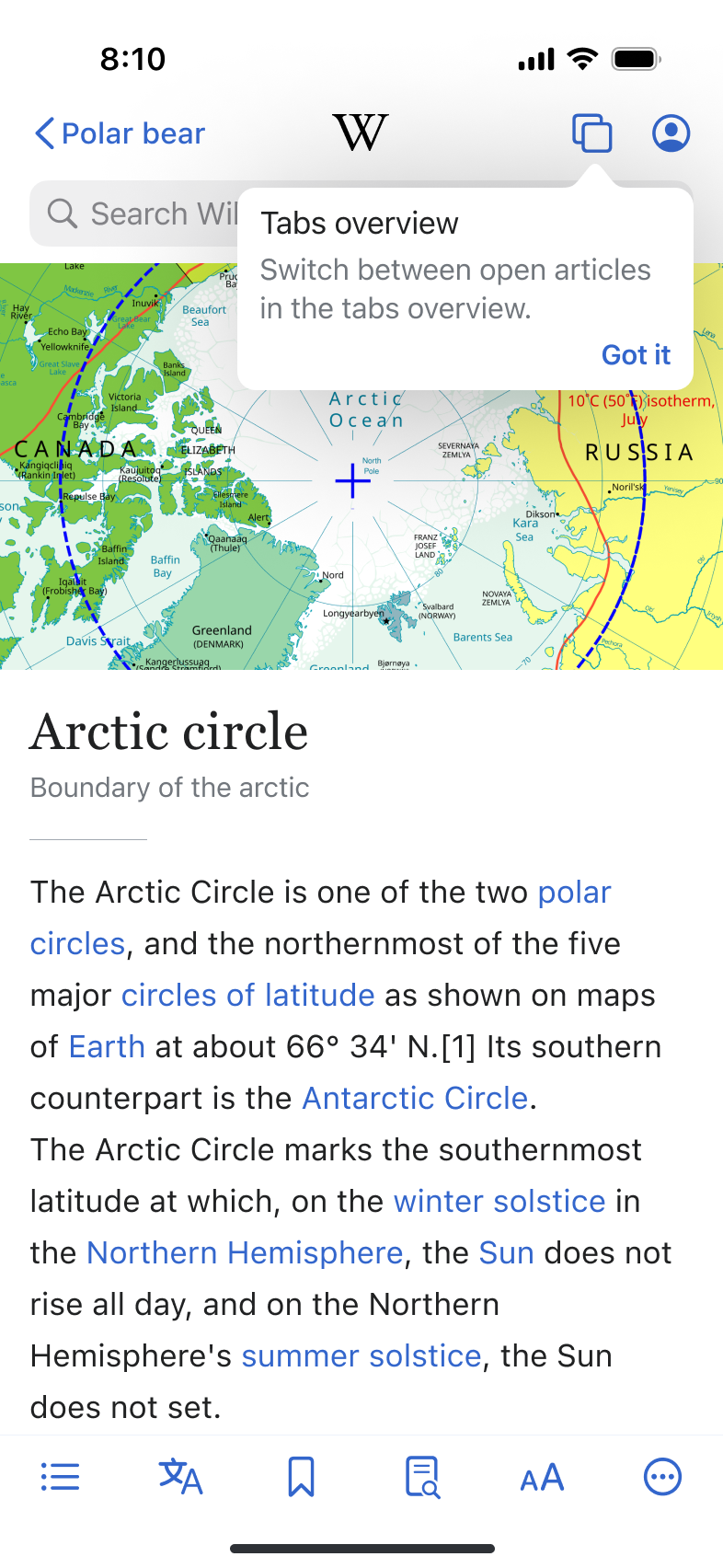 Contextual onboarding with tooltips
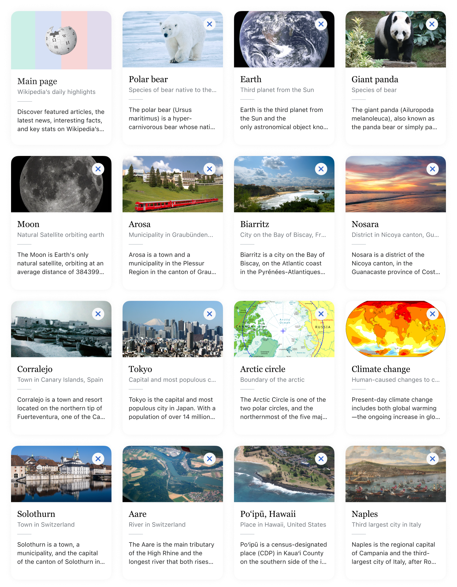
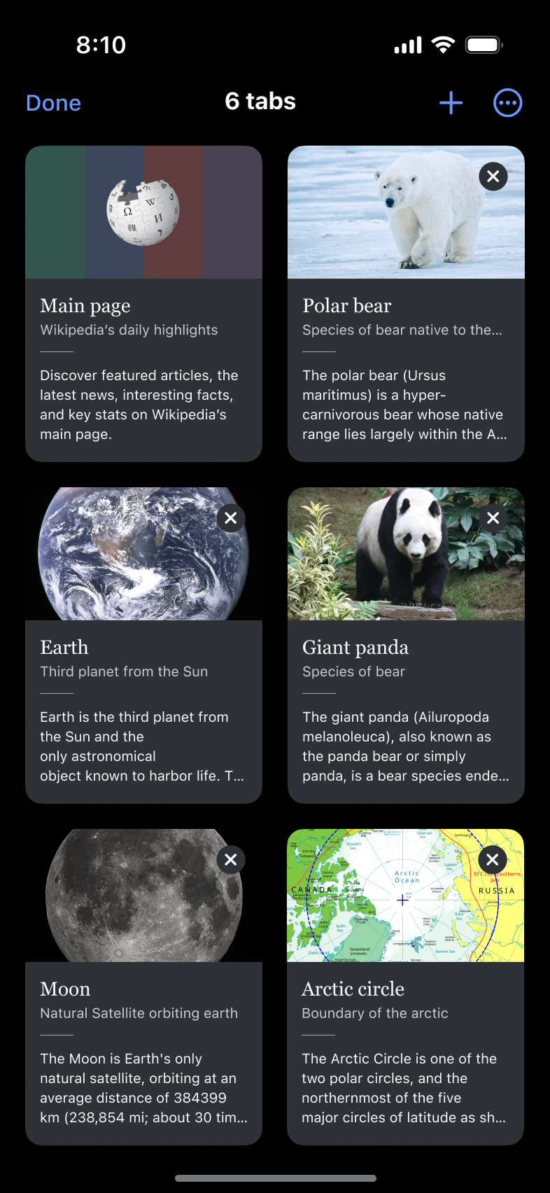
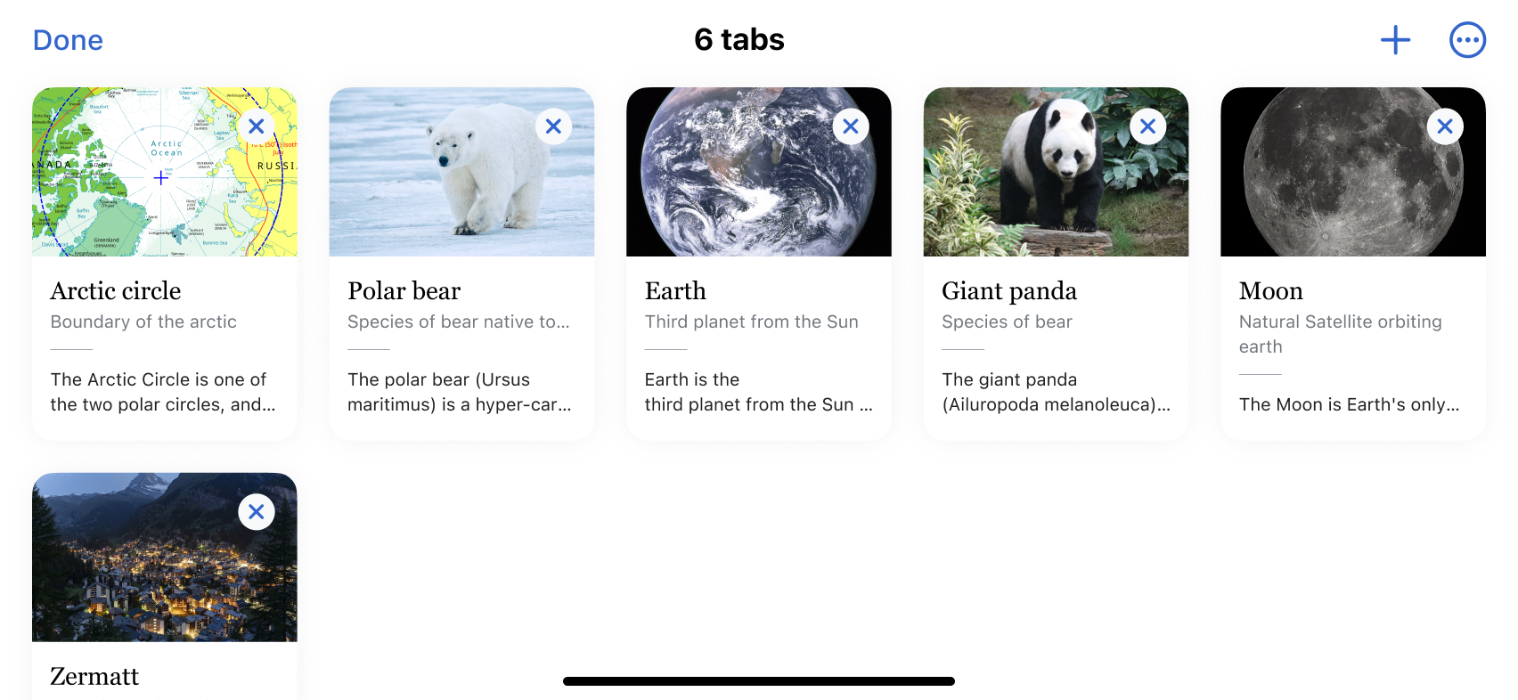
A dedicated overview page shows your open tabs and lets you switch between them with ease.
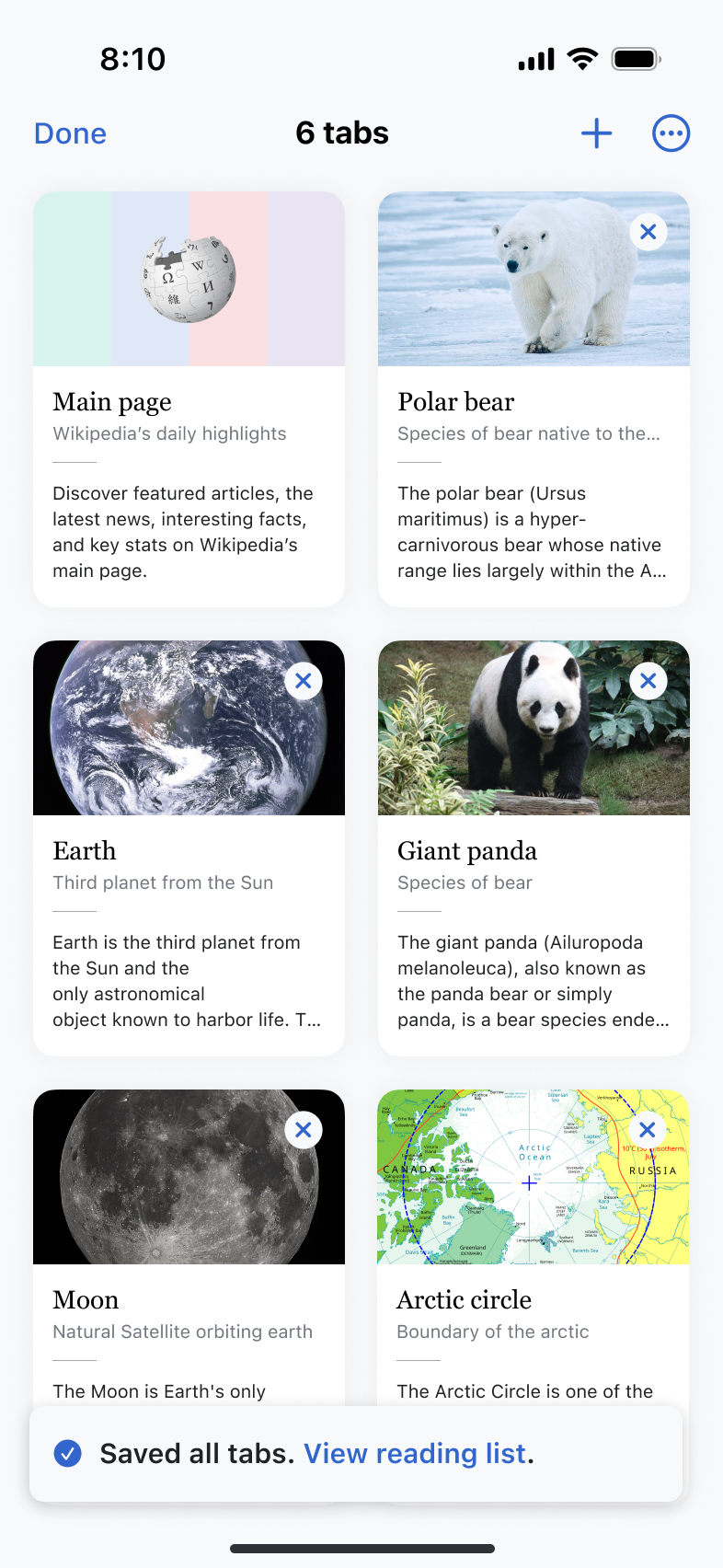 Overview page
Tap and hold a link to open it in a new tab — perfect for rabbit-hole reading.
 Links in the article page…
  …can be previewed with a long-press
You can open tabs from any view — including Places, which shows nearby articles.
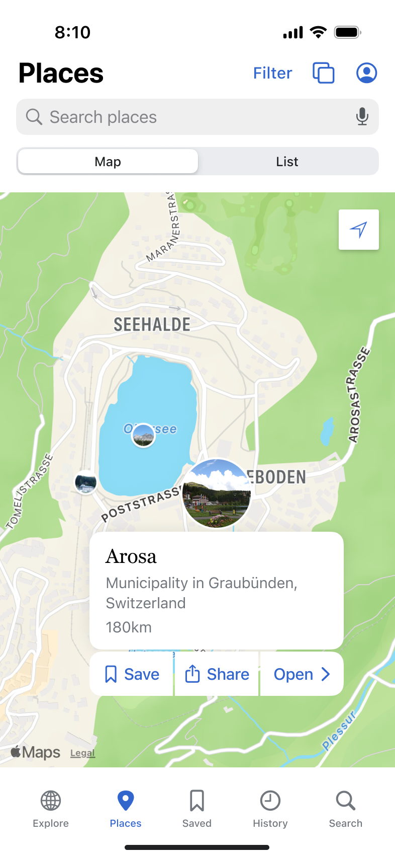 Access from Places
Tabs support both light and dark themes for seamless reading day or night.
 Dark mode
We designed for iPad too — with adaptive layouts that make the most of larger screens.
 iPad article page
 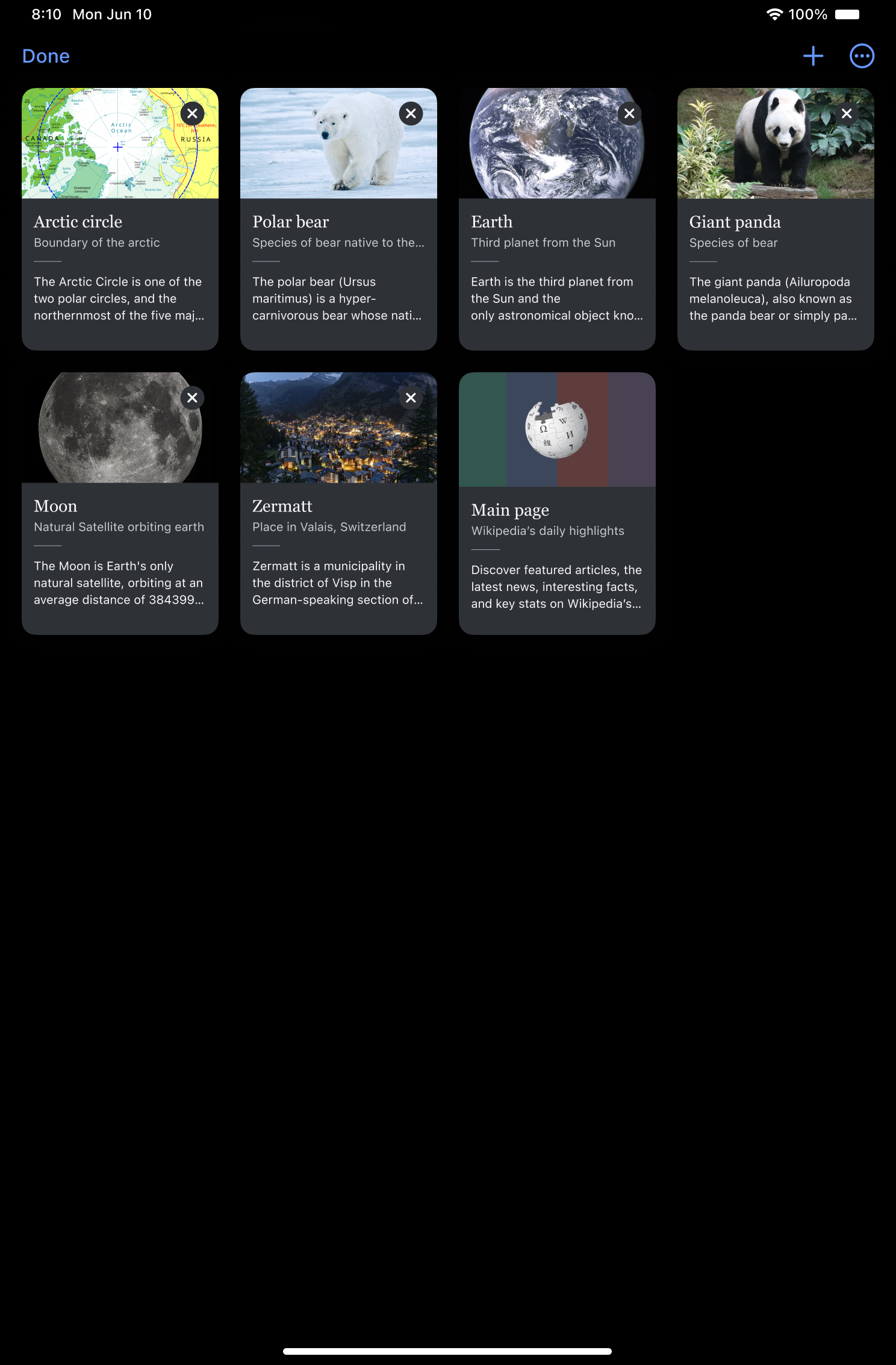 iPad tabs overview
Tabs rearrange themselves based on screen orientation, ensuring a flexible experience.
 Landscape designs
When searching, the app UI lets you know if an article is already open in a tab, to avoid duplicates.
 Displaying open tabs in search
The story behind the design
Tabbed browsing was the most requested feature for quite some time. Here’s some user feedback:
“Odd that the Wikipedia app on iOS can’t open multiple tabs like the Android version.”
“When I’m going down the rabbit hole, I can’t open many links in new tabs.”
“What kind of research and education application doesn’t allow for multiple tabs that I can reference and open without leaving my current one?”
That made us get started.
Understanding iOS feedback
We looked at App Store reviews and user messages. Here’s what we learned:
- Tabs were especially missed by users switching from Android.
- Lack of tab support was a common reason for 1–3 star reviews.
- Tabs are key for “rabbit hole” journeys.
- Users expected tab behavior similar to Safari or Chrome.
- Scroll position should be remembered.
- Tabbing should be fast — some even asked for gestures.
- Discoverability was critical since the feature hadn’t existed before.
Comparative review
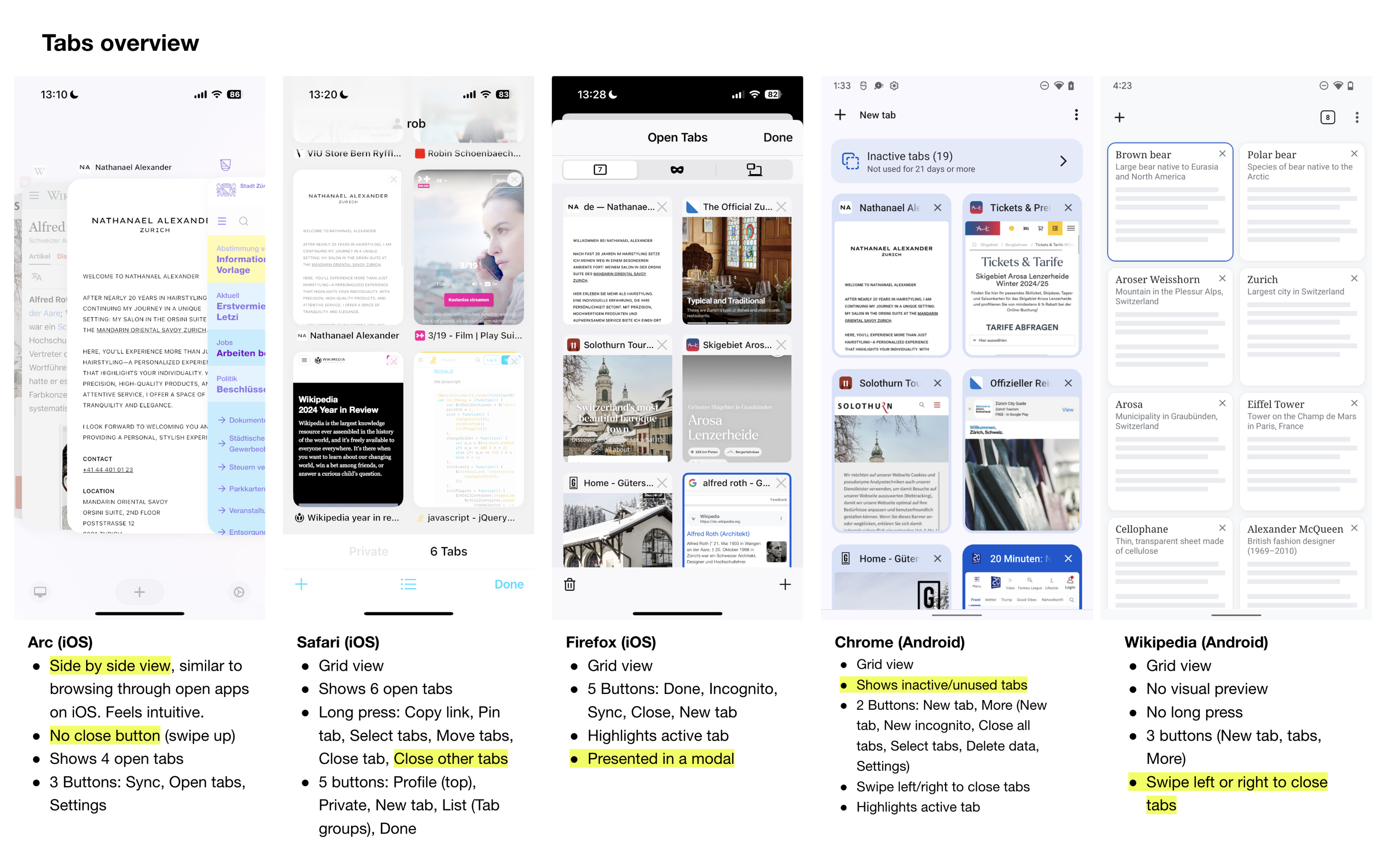 Example from the extensive comparative review
We compared tab behaviors across other browsers and apps:
Focus of the analysis were the Entry points, Tab overview page, Search behavior, New tab flows, and Settings.
Key takeaways:
- Tab sync and smart deduplication were common standards.
- Visual previews were essential in all apps.
- Some used gestures or bottom bars; others relied on menus.
- Background vs. foreground tab behavior was customizable.
- Features like “auto-close” or “save inactive tabs” were rare but interesting.
Prototyping and testing
We designed a functional prototype and ran unmoderated usability tests with 15 participants from Japan, the Philippines, Saudi Arabia, Australia, Malaysia, Egypt, Indonesia, and the United Arab Emirates.
What we learned:
- Most users intuitively understood how to open and close tabs.
- Long press on links worked well, but we needed to animate the tab icon to indicate that a tab has opened in the background.
- The back button label helped users feel in control and made navigation easier.
- Almost everyone preferred tabs to open in the foreground, not the background.
- Users wanted onboarding for tab-related actions.
- iPad users expected the layout to scale and show multiple rows.
Why we didn’t just copy Safari
When we started designing tabs, we wanted to make something that fits how people explore knowledge.
One of the trickiest design questions was: what should the Back button do in a world with tabs?
We didn’t want people to feel “trapped” in a tab after a few clicks. If there’s no meaningful place to return to, the feature becomes frustrating, especially in an app all about exploration.
So instead of a per-tab back stack, we chose a global back behavior across tabs. The Back button always takes you to the previous article you visited — even if it was in a different tab. It’s a small but meaningful shift, designed to encourage curiosity instead of limiting it.
What’s next?
We focused on the essentials — open links in tabs, keep them organized, and make discovery seamless. We already think about what’s next: syncing, more gestures, and connecting tabs with your reading lists.
Tabs will be released in June 2025. Try it out. And let us know what you think.