A simple idea led to a 64% increase in Mobile donations on Wikipedia
In my first year working on Online Fundraising at the Wikimedia Foundation in 2017/2018, I contributed a simple but powerful idea: What if our donation banner on mobile looked like a text message from Jimmy Wales?
That idea sparked a series of design and UX experiments and dozens of A/B tests, ultimately leading to a 64% increase in mobile donation rates compared to previous campaigns. The shift from an obtrusive modal to a more contextual banner made the experience less disruptive for readers.
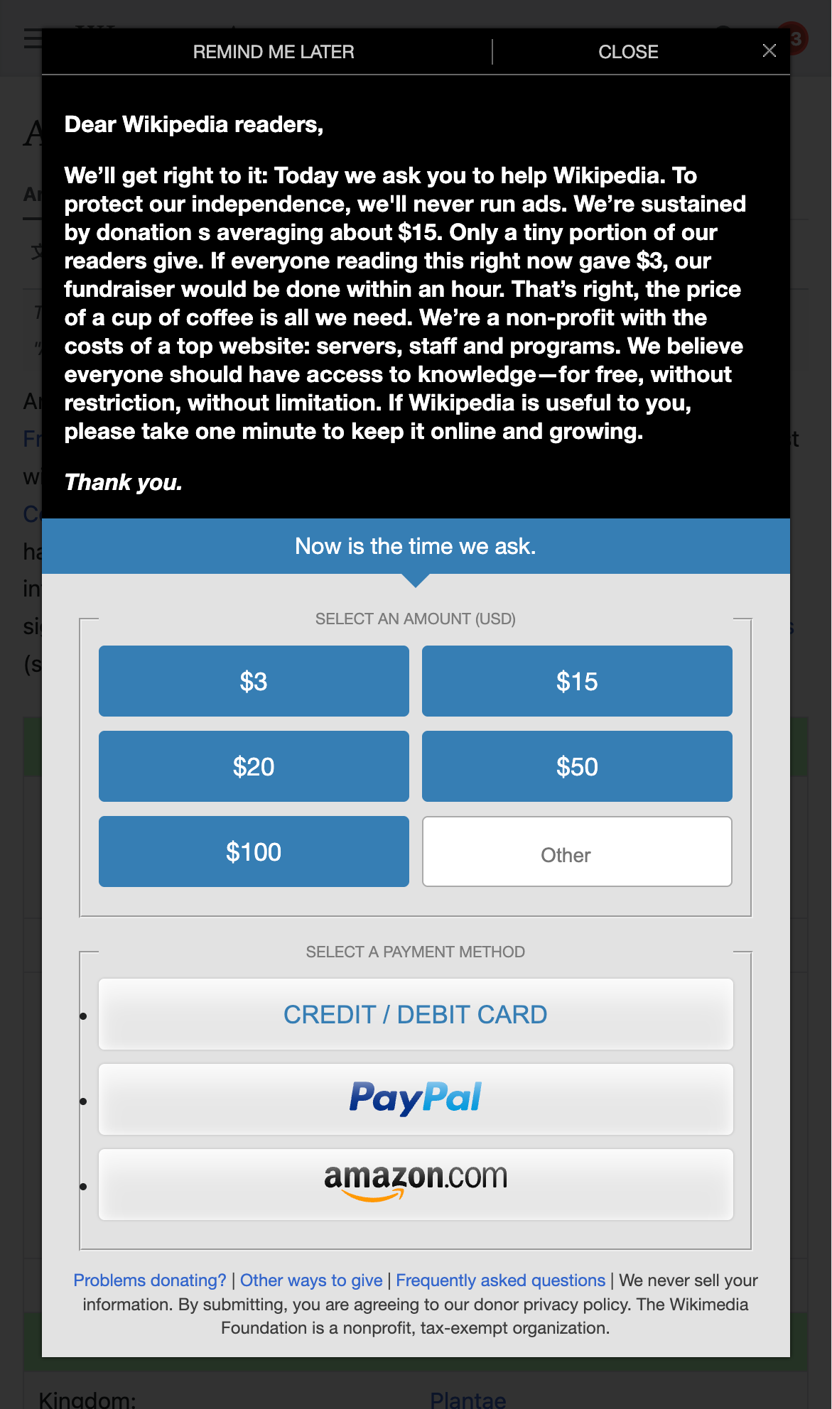 This is how the banner looked like before the changes.
We iterated through multiple versions — testing everything from message length to banner layout — and the final design (inspired by our desktop and email copy) delivered a significant performance gain while improving the overall user experience.
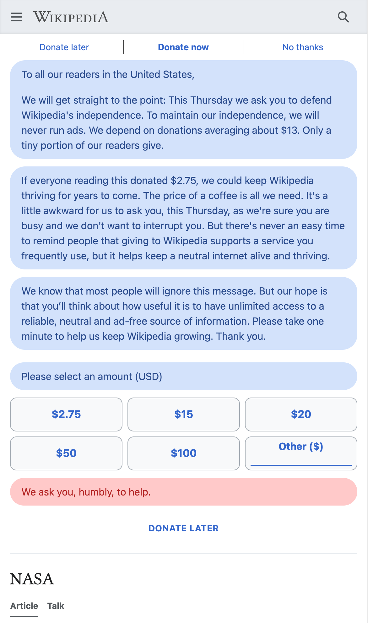 This is one design of the many A/B test iterations that lead to the 64% increase.
According to the Wikimedia Foundation’s 2017–18 fundraising report, revenue from mobile banners increased from approximately $8.2 million to $13.5 million, a 64% year-over-year increase. This growth underscores the impact of thoughtful design changes on fundraising outcomes.
Key wins
- A long-scroll format, optimized for mobile behavior
- Clear, complete donation form visible upfront (no hidden steps)
- Personal, time-relevant copy (“On a Tuesday like today…”)
- Less intrusive UI that blended into the reading experience
- Carefully crafted animations that mimicked the pacing of a real conversation
- Fully accessible form, with strong color contrast, scalable text, and full keyboard navigation support
What began as a playful idea in 2017 continues to live on today. As of 2025, the core concept — conversational, contextual fundraising on mobile — still drives donations across Wikimedia campaigns. The banner’s success shows how small, user-centered design shifts can create lasting, scalable results.
If you’re working on donation experiences and want to explore simple, tested ideas that move people to give, I’d be happy to help you find what works. Don’t hesitate to reach out at write@robinschoenbaechler.com.