Redesigning and improving the Wikipedia donation experience
Every year, Wikipedia relies on millions of small donations from readers worldwide. But on iOS, the path from reading to giving wasn’t always smooth. Users were taken out of the app, payment flows felt clunky, and the experience didn’t reflect the trust and clarity that Wikipedia stands for.
We set out to change that, and increased donations by 85% — read how.
Rethinking the donation experience
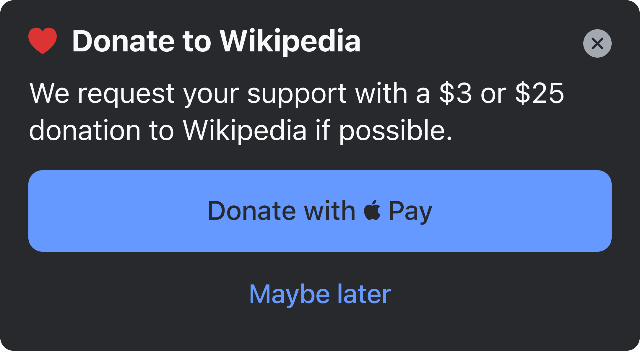
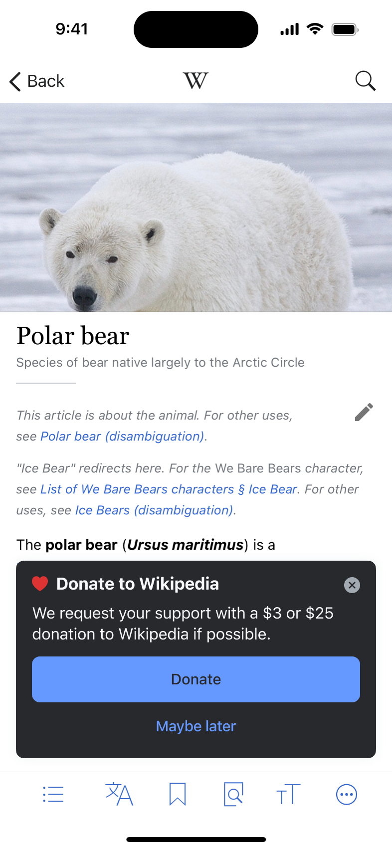 Concept for a donation banner
 Bottom sheet that let’s users choose their payment method
In late 2023, we launched a redesigned donation flow on the Wikipedia iOS app. The project consisted of two parts:
- A global entry point in the app’s Settings, available anytime
- A contextual experience surfaced while reading an article, where the intent to donate is often strongest
Most of our design work focused on the in-article flow, where we aimed to reduce friction, respect users’ attention, and increase the likelihood of successful donations.
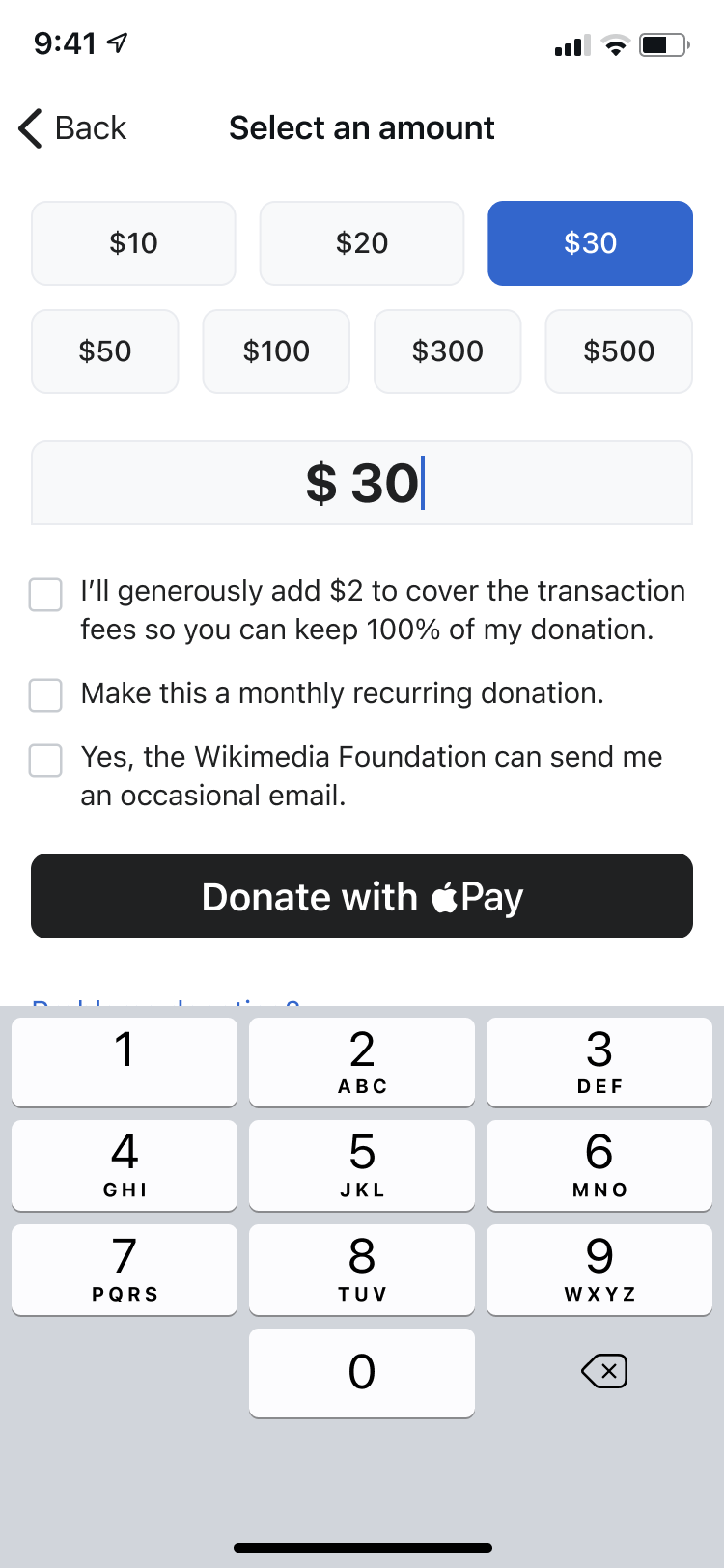 Amount selection
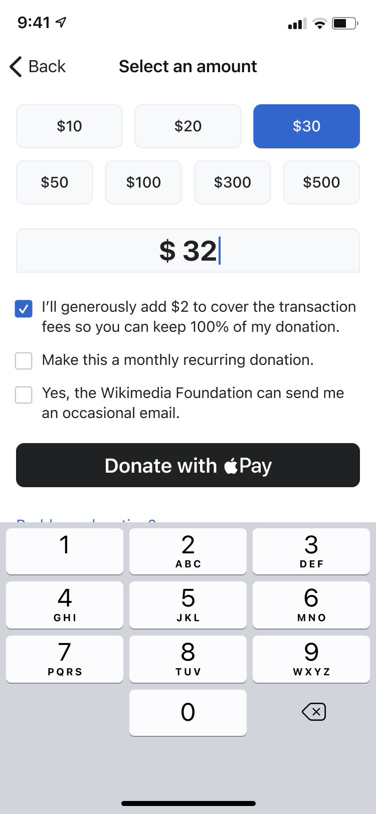 Pay the fee checkbox
We introduced:
- Native Apple Pay integration for seamless giving
- In-app webviews that keep readers inside the app when donating through other methods
- Support for localized, multilingual campaigns
- User-controlled banners, including “Maybe later” and “I already donated” options
- A flexible content system that lets the fundraising team update banners without needing an app release
Designing for trust and ease
From the beginning, we focused on removing barriers and making donating feel like a natural part of the iOS experience. A few design principles guided our work:
- Native feel. We wanted the flow to feel familiar and trustworthy by adhering closely to iOS conventions, including system sheets, Face ID, and Apple Pay.
- Make it instant. The keyboard appears as soon as users tap “Donate with Apple Pay” — letting them act without delay.
- Offer choices. Users can pick from preselected donation amounts to reduce friction, or enter a custom amount if they prefer.
- Inclusivity. Not everyone uses Apple Pay, so we provide a fallback bottom sheet with other payment options, all within the app.
- Keep the emotion subtle. A lightweight toast acknowledges the donation with warmth, without interrupting the reading experience.
Impact
 Checkout with Apple Pay
 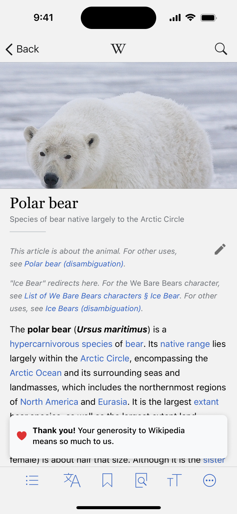 Thank you message
The updated experience has made a clear difference. Here are the highlights from our largest annual campaign across the US, UK, Canada, Australia, New Zealand, and Ireland:
- In 2022, the Wikipedia iOS app received 11,148 donations totaling $203,553, with a 52.1% click-to-donation rate
- In 2023, after reworking the flow, donations rose to 20,670 (+85%) and brought in $330,362 (+62%), with a conversion rate of 82.2%
- In 2024, we sustained strong performance with 18,708 donations and $290,136 in contributions, and raised the conversion rate even further to 85.2%
Final thoughts
Designing for donations isn’t just about increasing revenue. It’s about honoring people’s intent to support something they value. By making the experience more intuitive, more respectful, and better localized, we helped turn that intent into action.
We’ll continue refining this flow, exploring what works across different countries, and listening to our readers, because how we ask matters just as much as why.
If you are looking for ways to make money in your organization, don’t hesitate to reach out to write@robinschoenbaechler.com.