Improved information architecture for Wikipedia on iOS and iPadOS
 One of dozens visual explorations for the redesign
We’ve redesigned how you navigate Wikipedia on iOS. The navigation refresh enhances usability, aesthetics, conformity with the Human Interface Guidelines, and discoverability across screens.
We realigned and redesigned the app bar with deep care and love for the Apple ecosystem. Typography was refined to remain bold while conserving vertical space. The app bar now disappears while scrolling, letting the content take center stage. An approach that, to our knowledge, hasn’t been executed like this by another iOS app before. We also standardized the tab design to match iOS 18 guidelines.
 The app bar/header on all screens…
  Disappears on scroll
Why we made these changes
- Edit tools weren’t discoverable enough, and user-related user links like the profile page were hidden in Settings
- The donation call to action was buried in Settings as well
- iPad navigation has fallen behind since iPadOS 17 introduced the floating tab bar
- Search in article view was hidden behind an icon, despite findings from Android that show users prefer a more prominent search field
- This redesign lays the foundation for tabbed browsing
See Tabs for Wikipedia on iOS
What we learned
We conducted an A/B test across Arabic, French, German, and Japanese Wikipedias, complemented by usability testing and surveys. One clear result: making the search bar visible directly in the article led to more usage.
 Variant A: Search icon only
 Variant B: Prominent search bar
Users in the test group initiated 23.8% more searches from article view (B) compared to those with the older (A), icon-only version. The change made it easier and more intuitive to start a new search without breaking the reading flow.
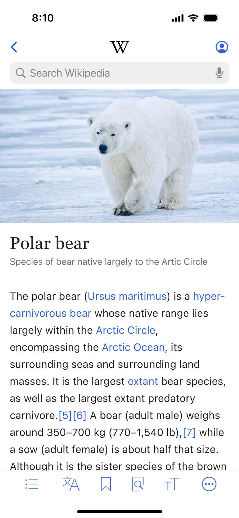
What changed
Search that fits your reading flow
The article view now includes a visible search bar at the top of the page. Instead of backing out to another screen, you can start a new search immediately. The design feels more familiar to those accustomed to browser interfaces.
Read more in the A/B test summary on MediaWiki.
More prominent donations and easy access to edit tools
Before the redesign, users could access their edit tools and donations only on the Explore Feed view via Settings and Account.
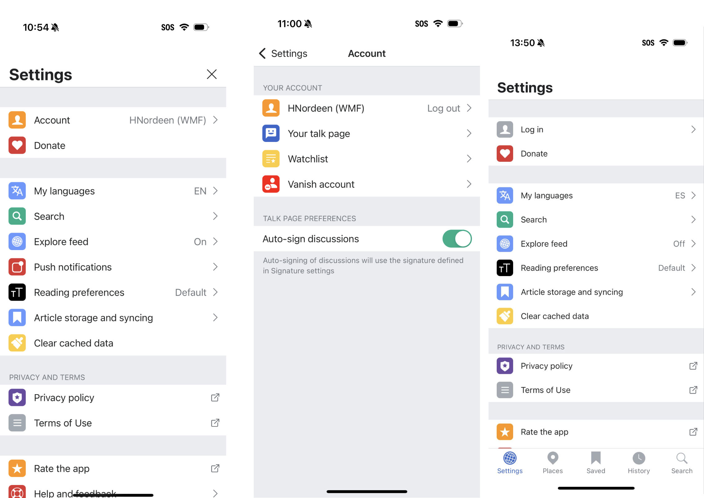 The old information architecture made it hard to access essential links
The newly introduced Profile menu is now accessible from all major views, including the core of Wikipedia, the article view itself. Whether you’re reading, editing, donating, or checking your Watchlist, the tools you need are close at hand.
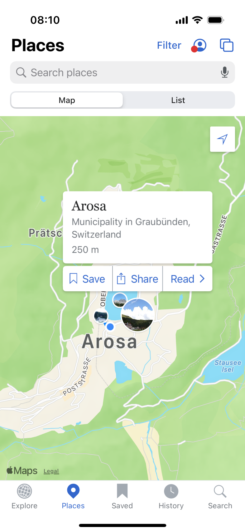 Profile menu access via Places
 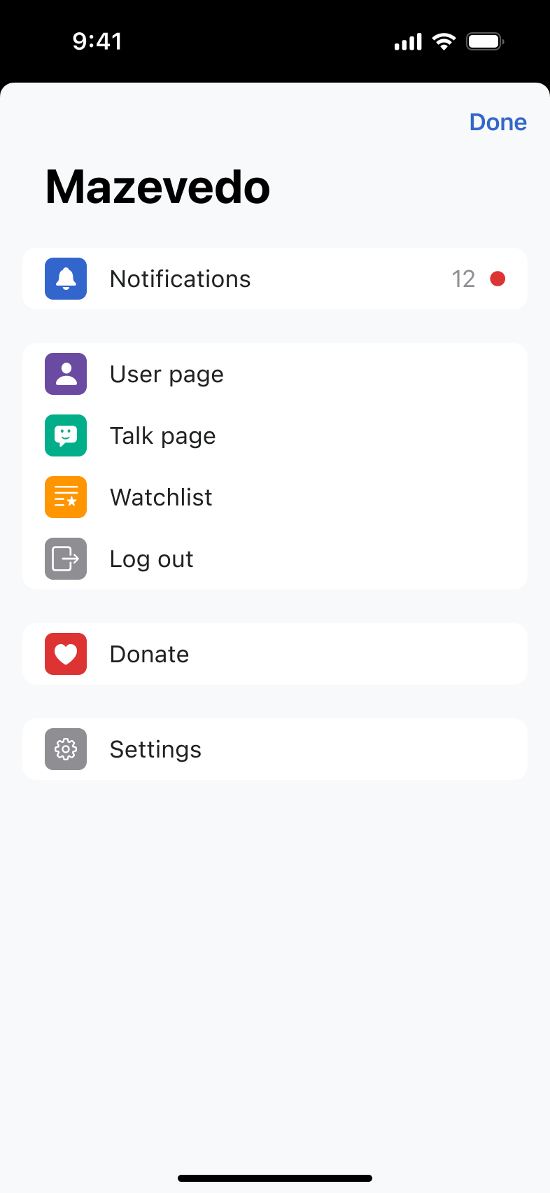 The new profile sheet is accessible yet colorful
A better iPad experience
Again, iPad wasn’t an afterthought. It received dedicated attention and layout updates for a better large-screen experience.
 The iPad with the prominent floating tab bar
 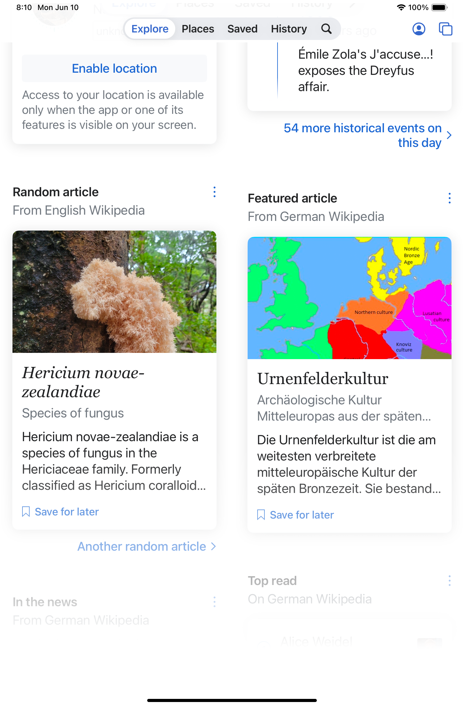 With a focus on content-first
We added a floating tab bar on iPad to match native iOS patterns. It adapts to various orientations and screen sizes, making the app feel more fluid and comfortable on larger displays. The layout was specifically designed for the iPad and not simply scaled up.
What’s next
With the foundation in place, the next step was rolling out tabbed browsing. You’ll be able to open multiple articles and switch between them, similar to a web browser. Read in the article on tabs, though, why we haven’t just copied Safari.